new illustration work
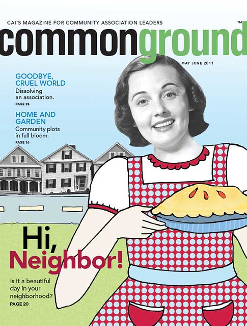
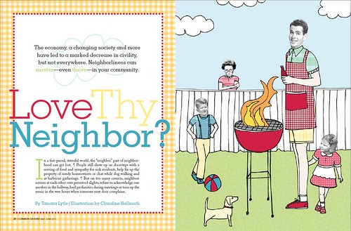
Here's a recent set of illustrations that I finished for The Community Associations Institute's Magazine.
The article was all about neighborliness (or lack there of) so this is what I created for the cover.
And here's a piece for the inside spread complete with nosy neighbor looking over the fence :)
I had so much fun creating these illustrations! Great theme and I got to play with all my favorite colors too!
Labels: illustration
COMMENTS:
<< Home
Lol! I love that nosy neighbor looking over the fence...:) :) Hasn't everyone had that experience?! These are GREEEATTT!
Post a Comment
<< Home


 Name:claudine hellmuth


