
illustration friday: racing
I'm working with my dollhouse project again for this week's illustration friday theme of "racing"
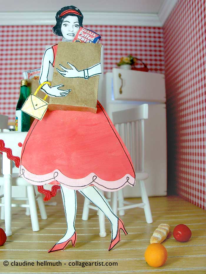
I don't know about you but when I go to the grocery store I am always racing around like a mad woman trying to get out of there and home as fast as possible. Groceries flying everywhere as soon as I am in the door. Grocery shopping is my least favorite thing to do!
So for this theme of "racing" I have my dollhouse character racing home from the store just like I do!
What's really fun experimenting with this 3-d way of working, is that I get to play with perspective in a way that isn't as immediate with my 2-d collages.
for #1 the camera angle is from below the figure
for #2 the camera angle above the figure.
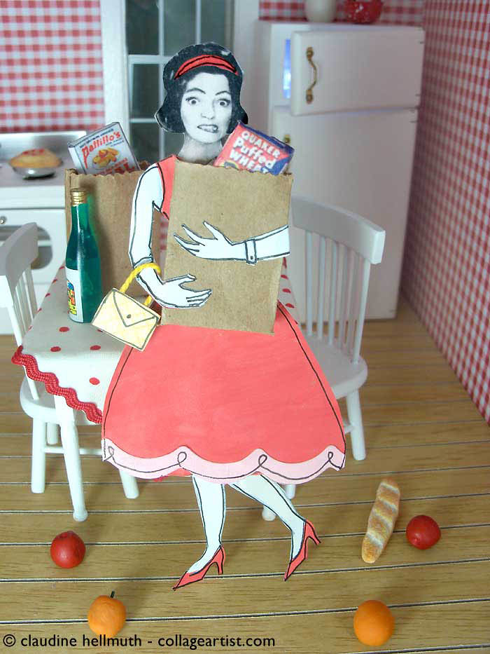
My photography wasn't perfect on these because I was "racing" to finish, but still had a great time playing with different perspectives.
Paul already weighed in and he says #2 with camera up high .....which angle do you like best?
have a great weekend!
I don't know about you but when I go to the grocery store I am always racing around like a mad woman trying to get out of there and home as fast as possible. Groceries flying everywhere as soon as I am in the door. Grocery shopping is my least favorite thing to do!
So for this theme of "racing" I have my dollhouse character racing home from the store just like I do!
What's really fun experimenting with this 3-d way of working, is that I get to play with perspective in a way that isn't as immediate with my 2-d collages.
for #1 the camera angle is from below the figure
for #2 the camera angle above the figure.
My photography wasn't perfect on these because I was "racing" to finish, but still had a great time playing with different perspectives.
Paul already weighed in and he says #2 with camera up high .....which angle do you like best?
have a great weekend!
Labels: dollhouse project, illustration friday
COMMENTS:
<< Home
sorry claudine, i have to agree with paul on this one...her head looks too small in the first one and more stuff shows on the floor in the second one as well......
# posted by  : 8:27 PM
: 8:27 PM
I like #2 the best. I just think it looks better. The key to this grocery shopping thing is to see if your husband will do it for you. My husband(retired) started doing it for me after I had some surgery and I convinced him that he was saving us money and so he's still shopping. I hate grocery shopping!!!!
I'd go for the second picture as the body looks more proportioned. I doslike food shopping it is made much more harassing as I haave my 3 year old with me :(
Your work is really amazing. Concerning this one, in my opinion, the second version is the best (the head in the first one is a little small).
Alberto
Alberto
Heisann!
Like it, but you seldom see me in this position, my husbad do the buying (cause he use the car.... I go home from work!)
Have a nice Sunday ;:OD)
Like it, but you seldom see me in this position, my husbad do the buying (cause he use the car.... I go home from work!)
Have a nice Sunday ;:OD)
They're both very cool....but my vote is for #1. Just as others have said....the emotion comes through stronger in that one!
I like this so much...what a great idea to use a dollhouse! You are so clever. I prefer #2...but they're both great.
Since you seem to be asking for opinions here's my two-cent crit: I would not have put the apples and oranges in such an orderly mirror image arrangement on the floor...although this issue is not apparent in image #1.
Since you seem to be asking for opinions here's my two-cent crit: I would not have put the apples and oranges in such an orderly mirror image arrangement on the floor...although this issue is not apparent in image #1.
Hey Claudine! I like #2. The PIE is visible and she seems more stressed. Great angle(s) Nice work.... as usual!
Hi, I am with you. I despise the store, too! This has me smiling though...yes, I love #2, too. she does look more stressed - perfect!!!
Hi Claudine. I've seen all your blog and I congratulate you, you are very creative. and put a touch of fun in what you do!.
This is so great!! I like number 2 as well...it seems to incorporate a fuller view of all the background items. Love it!!
wow love both pics, so much fun...but I think I'll go for NUMBER 2, it makes me look right to her face full of stress. Number 1 is good too but it makes me think she's more scared than stressed... a mouse in the kitchen come to my mind :D
wow love both pics, so much fun...but I think I'll go for NUMBER 2, it makes me look right to her face full of stress. Number 1 is good too but it makes me think she's more scared than stressed... a mouse in the kitchen come to my mind :D
The Puffed Wheat gives me giggles!
I prefer #1 hands down! #1 is much more dramatic. I love that you can see more of those great red gingham walls. Great angle on the fridge, and even the bread and the fruit on the floor make a nice composition.
I love color and the colors are popping in #1!
Post a Comment
I prefer #1 hands down! #1 is much more dramatic. I love that you can see more of those great red gingham walls. Great angle on the fridge, and even the bread and the fruit on the floor make a nice composition.
I love color and the colors are popping in #1!
<< Home
 Name:claudine hellmuth