CLAUDINE HELLMUTH
CLAUDINE HELLMUTH blog   

illustration friday: opposites
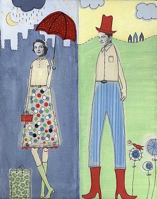
Here's my submission for Illustration Friday's theme of "opposites". At first, I had a little bit of a hard time with this weeks theme. Thanks to my wonderful husband for the idea of the "split screen canvas."


(click image to enlarge)

I tried to include as many opposites as I could: man/woman, cowboy/city girl, rain/sunshine, night/day. After my initial freak-out of not knowing what to do with this topic, I ended up having a great time with it. Thank you Illo-Friday for making me push myself, it was fun!

Labels: ,

COMMENTS:
Love this one a lot!
:))
 
great concept and nice work as always :)
 
This is beautiful. They might be opposites but they still seem connected in some way!
 
I hit the panic mojo as soon as I saw the topic...I stalled all morning..even suggesting to the children to draw opposites...WAS AWESOME to see what they came up with..night and day were their opposites...the stars looked like christmas tree ornaments...hehehe...well anyways it was a challenge for me today...
I do love your crisp lines and her feet...i struggle with feet hehe
 
I think they could be very happy together. "Goodbye city life".
Love it!
 
Very cute, excellent job. there's those flowers again :)
 
Good concepts! aNd gReat iDeas.
 
He wants rain for his crops.
She wants sunshine so she can shop.
 
What a wonderful collage mix media piece!! You arts is always to unique and lovely!
 
this is a great style
 
Excellent ! i still love your style, great great artwork ;)
 
Another fun illustration! Your collage work is so perfectly done and stands out among the many collage artists in blogville!
 
Terrific as usual Claudine. The skirt, bag, umbrella and pants textures are amazing. Well done.
 
LOVE it! especially the animal print bag! Exceptional as always!
:) Abbie
 
I had fun with this one! I liked counting up the opposites, and love your little scenes. The singing birdie grabs my heart.
 
this is really beautifully done Claudine, great fifties color scheme and retro feel to this one, I'm off to get a vanilla malted and listen to some Patsy Cline!
 
This is fantasic! I love how you took the "opposite" them to the limit with the layers of "opposite". And I love the split screen idea! Husbands are pretty useful at times aren't they? :-)
 
Hmmm. I think they go together like peanut butter and jelly. :-)
 
really coooooool ;-)))
 
all of your works just amazing, i like tke colours that you use, and the tall figures too
 
Your work is so damn good! Love this piece to pieces!
 
Green Acres is the place to be! :)
 
I really love your work, colors, line, etc...
 
i like where you have chosen to use detail and leave other specific areas monochromatic. overall color palette is nice, too.
 
This looks awesome...Love it.
 
I love this...very opposite! the colours are beautiful...

Ouissi x
 
Hey claudine
I'm always looking forward to seing your contributions... and I like this one again! =) keep it up =)
 
Don't you find find that the illustrations you struggle the most with are the ones you end up liking the most? This turned out great!
 
nifty red boots on that gent!
 
This is great! I love your concept on this one, and I always love your style! Very cool.
 
nice idea and illo like
 
I like the way you captured so many opposites and all the fun patterns you used, including the leopard print shopping bag. After seeing yours I realized I could have left my illo the way I originally had it instead of "fixing it". Originally the head of one cat was above the body for the other. I was afraid it would be too confusing, but now see it could have just been one more opposite! I'm glad you described your process--it was helpful to hear someone else going through that too.
 
The split screen works fantastically. I love your style as always. I wonder if lady in the rain is waiting at the bus stop to catch a bus to visit man in the hat...?
 
swweeet!!
 
Good work, Claudine. Keep it up.
 
Very effective for the theme. I love the way the b/w headshots give the entire piece a retro-feel...even though it's only their heads that have come from a 50's-esque publication. Nice work.
 
Claudine, looking at your illo makes me very happy:-). It is so cute! All the opposites appear to be so wonderful in your picture!
 
Cool concept! You do really interesting and unique work, I love it! Thanks for posting at my blog, and the kind words :).
 
Y'know, I really like your work! Another great illo!
 
I REALLY like this one, Claudine.
 
This is really cute and really creative! Sometimes it is good that ideas on't come to you so quickly...makes you think out of the box and try new things! I wish I had her skirt!
 
Isnt this the truth! Love those red boots! All of the patterns are just wonderful!
 
cool graphics. you did a great job on this illo.
 
really nice
 
What a lovely image! I can see, you've had a fun time when creating it - and now I have! It's fun to look for the opposites!

I like your flowers and the little red bird singing! You have your own, wonderful style.
 
You have a unique style as always. Particularly love the umbrella and the design on her skirt. Very retro!
 
Lovely, lovely.
I love your work! Tasteful and cool!
I will check inn often! Thank you and keep up the fantastic work.
:)
Camilla
 
Yep - this definitely has the green Acres thing going on! Great characterizations...all the right props. Good job:>
 
LOVE IT!!! What a fun piece and love the wonderful colors you used too!!!
 
great whimsical pairing! i love the mix of textures and strong basic colors.
 
niiiice!!!!
 
Claudine, I knew I would be in for a treat coming here. Don't worry, no pressure: I just happen to know that you are capable of no wrong...

Your work always cheers and amuses me.
 
Wonderful I like the split canvas idea and the colors are wonderful.
 
terrific - such a cool style and the faces are just right
 
I love this! I've never tried this style before but looking at yours makes me want to give it try. The skirt is my favourite :)
 
very a nice job !
 
Wonderful Claudine! I love how colorful they are. . .and I adore her green tote! Awesome!
 
Your work is beautiful and inspiring! I'd love to see it animated.
 
thank you so much for all your wonderful comments about my artwork! I so appreciate it. I really fretted over this piece, so it makes me feel good to know that you like it :)
 
Fabulous - I love her skirt, I want it! Just saw your book on Amazon today, great stuff.
 
Great! I love the "split screen canvas", and I love that you have included so many opposites!

Anette
www.wynlen.no
 
Love your image...your style is so free and fun! I watched your "how to" video! Great stuff!
 
Wonderful job combining everything together. I really enjoy the colors in this one.
 
Great opposites idea - your work is wonderful!
 
Your style is awesome. this is almost like the old old tv show green acres. great!
 
lovely! I like stripes vs. polka dots too. they are sort of opposites, but I like to wear them together sometimes anyway :)
 
i love the folksy style of your drawings! cool!
 
I absolutely love the skirt and umbrella patterns, and they work so well with the rest of the wonderful illustration!
 
great work!
 
oh..I LOVE this...the patterns, the city..great pair!
Fantastic collage...

saludos..always.

Marjorie
 
Your ladies always wear the coolest skirts! Where do they shop? Can't wait to see them in a set of stirrup pants! ; )
 
its such a great piece, I espeically like the cowboy's hat and boots and his harry highpants :)
 
Love this one... :)
 
Great juxtaposition! I love your stuff!
 
Really love your images, like the small details like the little bird and clutch purse!
 
This is wonderful. nice to see you pushing the limit. :)
 
Post a Comment

<< Home

press
contact me
my books & dvds
books with my work
previous posts
archives


Powered by Blogger
SUBSCRIBE TO THIS BLOG'S FEED
all artwork and text
© Claudine Hellmuth Creative LLC
content of this site may not be reproduced in any manner without advance written permission


artwork portfolios | licensing | product shop | workshops & events | press room | blog | about me | contact | home

CLAUDINE HELLMUTH : Hip Art for Playful Hearts : Mixed media Collage and Custom Commissioned Artwork


All artwork and text in this web site copyright © Claudine Hellmuth Creative LLC